Goldman Sachs Documents Delivery Preferrence Enhancement
Context
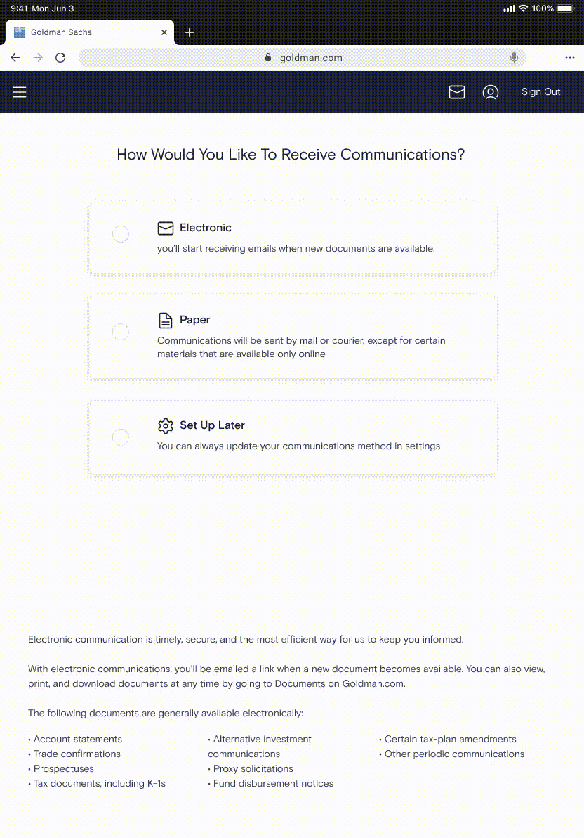
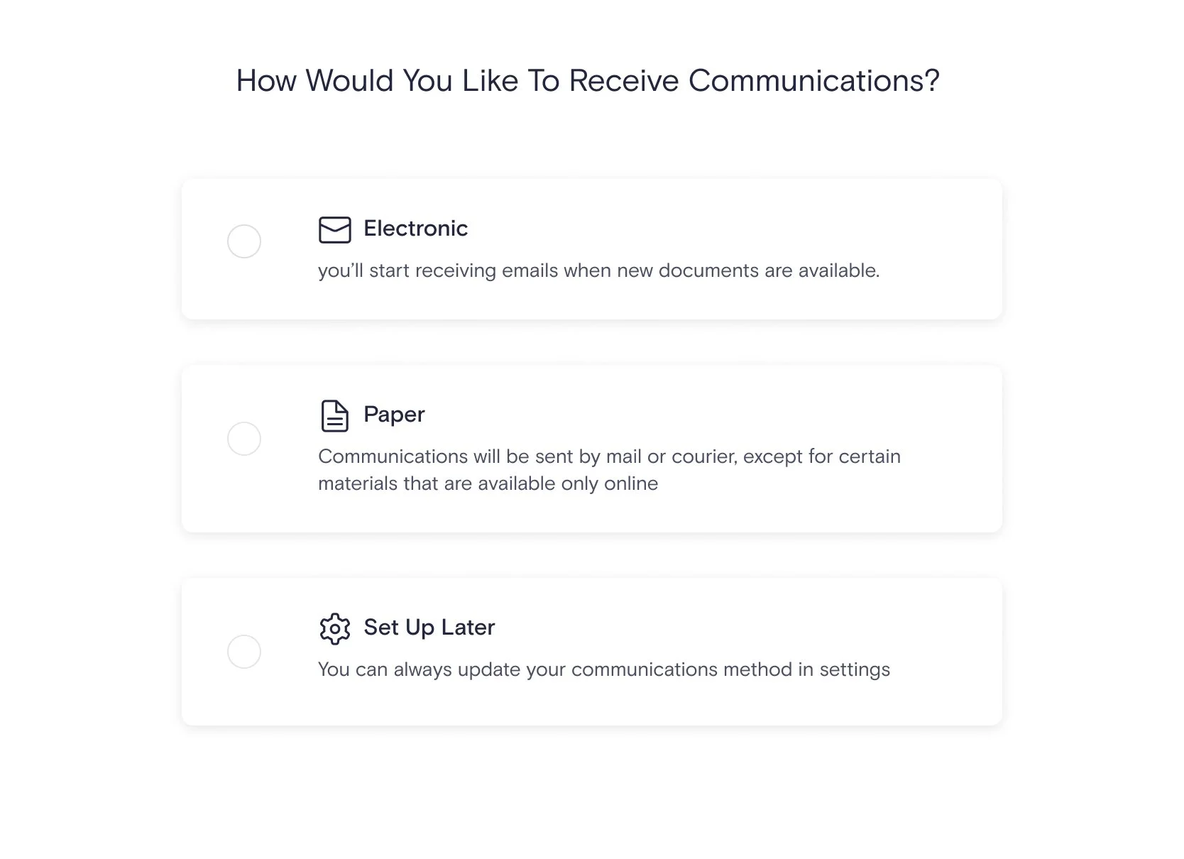
E-delivery is one of an Goldman Sachs wealth management account configurations that allows clients set up if they want to receive the account documents and statements through paper or email. It can be set up in the first-landing experience or Settings of the website.
We got some client’s feedback that the tablet & mobile experience to set email as preferred approach is unsatisfied.
Problem
Data & Research team conducted a user interview and found out the problem is the bad usability that mainly focused on two pages:
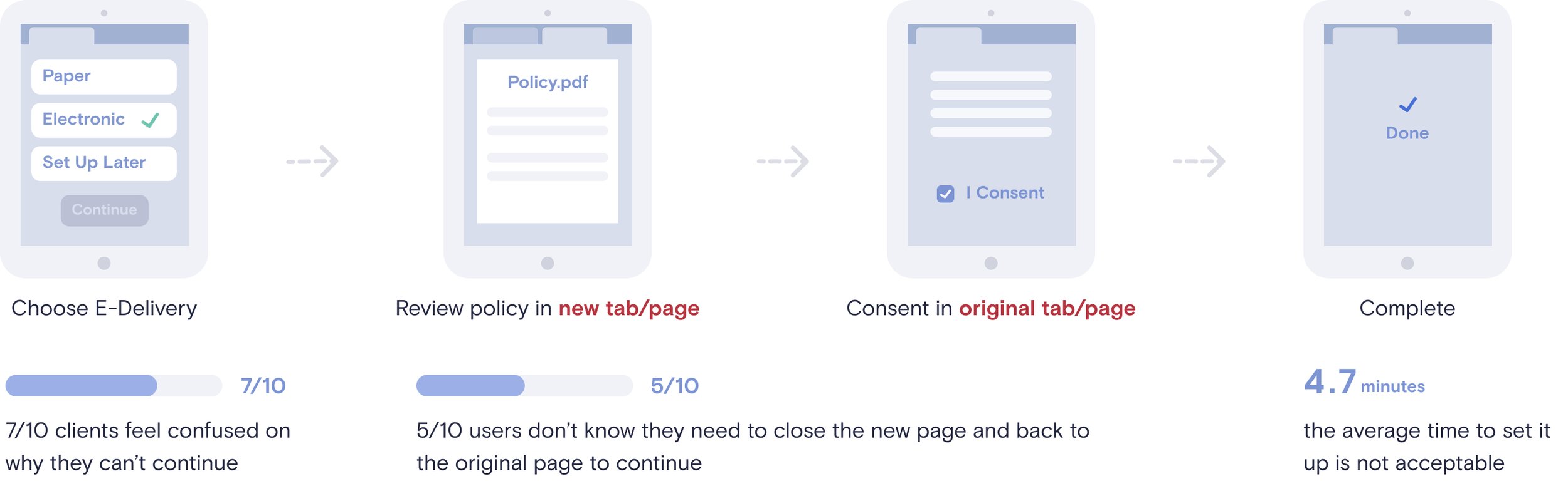
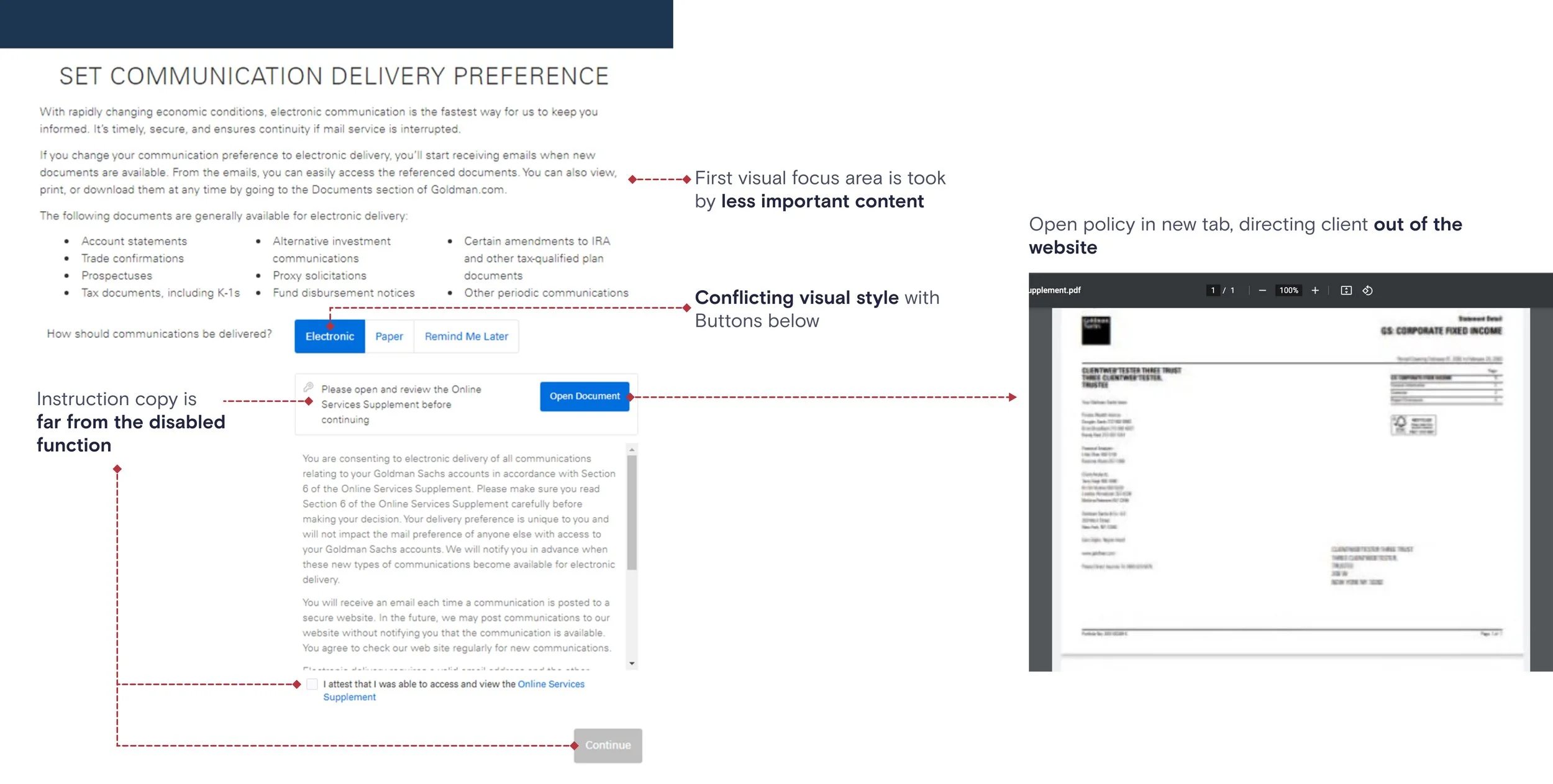
1) when client selected an approach, it’s not clear that reviewing policy is mandatory to continue.
2) When client review policy, they are directed outside the website, and they don’t know what should do in new page
Heuristic Analysis
With the feedback, I took a look in the detail screens, and conducted a heuristic analysis to the current website to see how can I improve the flow
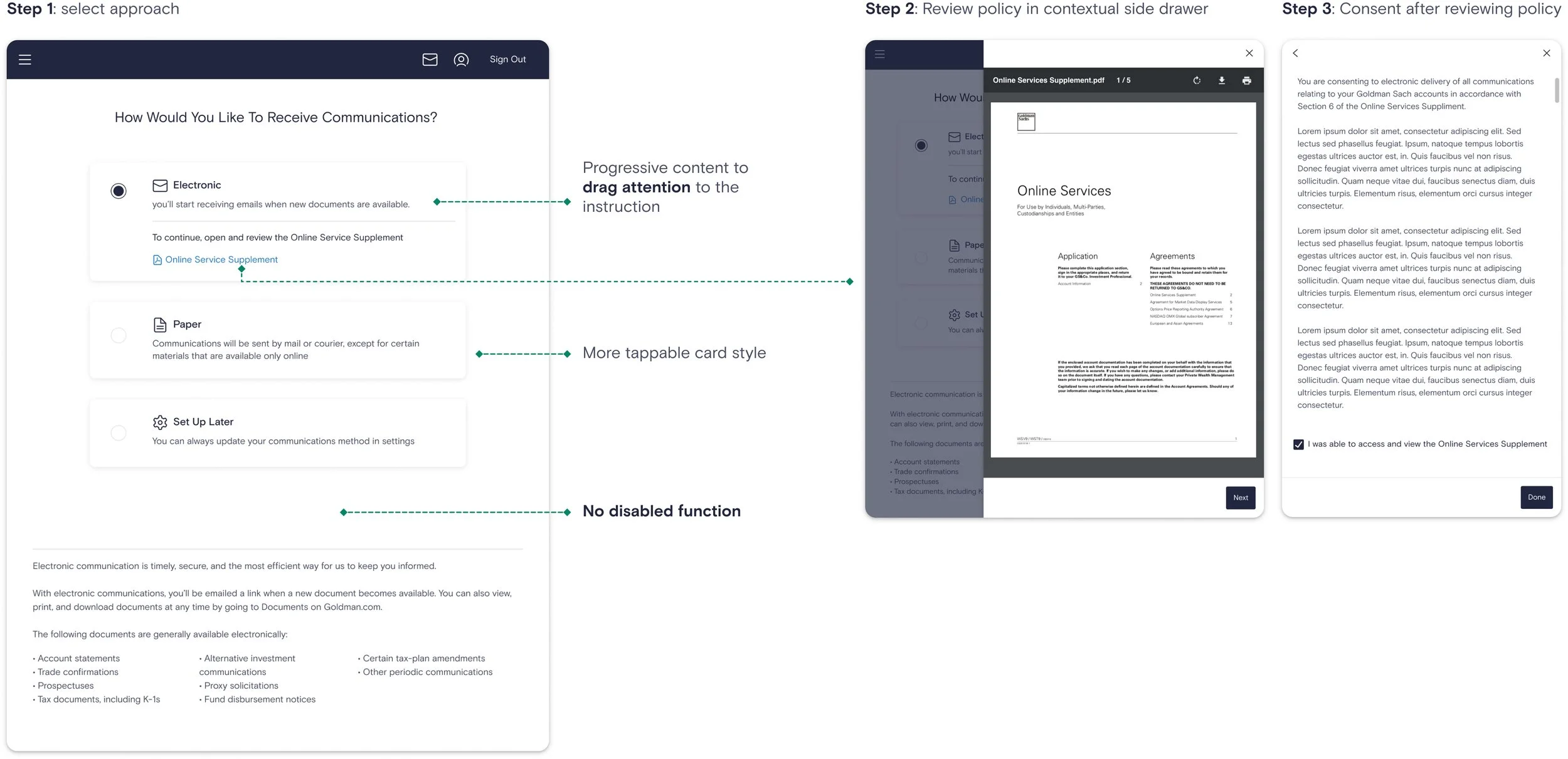
First Proposal
I proposed to redesign the landing page, and split task into small pieces. Only asking client do one task a time to reduce their recognition load, and open the Policy document in site.
Tech limitation & Solution
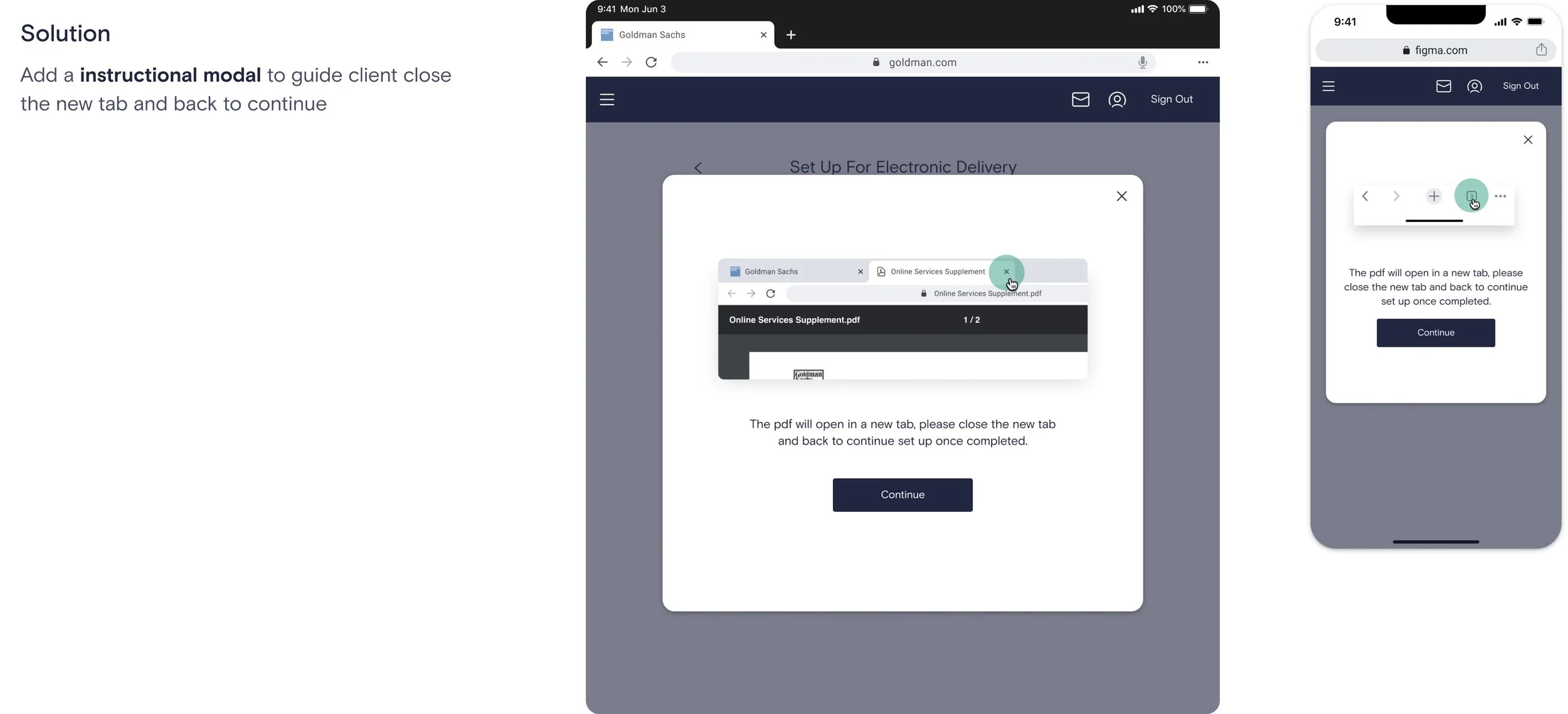
When we reviewed with development team, they told me that there is a tech limitation to open the pdf in site. Given this constrains, adding an instructional step is the approach we should go.
It’s important to empathize to elder people that it needs some effort to read a paragraph of instruction. So I used the imagery approach to make the instruction more easy to understand at a glance.
Final Delieverable & Outcome
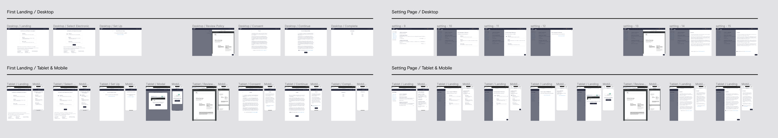
Delivered multiple breakpoint design considering the responsiveness. Reuse the component and layout in both first-landing set up and Settings configuration.
The average time also reduced to less than 3 minutes to complete the set up.